
Inclusive design: From approach to execution
Bruce Wyman, USD Design | MACH Consulting, USA, Corey Timpson, Corey Timpson Design Inc., Canada, Scott Gillam, Canadian Museum for Human Rights, Canada, Sina Bahram, Prime Access Consulting, Inc., USA
Abstract
At the Canadian Museum for Human Rights, there was an early mandate for inclusive design to be implemented throughout the museum experience. This mandate resulted in a variety of designs and intentions that ultimately required development and implementation strategies to provide access to content through a universal keypad (for screen and audio controls); a mobile application using low-energy Bluetooth beacons; and content available in two languages, two forms of sign language, two descriptive audio tracks, and two sets of captioning. This complex set of variables was difficult to balance, and the authors discuss the implementation strategy and production and development scenarios encountered by trying to execute the greatest of ambitions.Keywords: accessibility, a11y, exhibits, interface, user experience, fabrication
1. The greatest of ambitions
At the Canadian Museum for Human Rights (CMHR), there was an early mandate for inclusive design to be a key characteristic of the museum’s culture. What is inclusive design versus accessibility, and why does that matter? What provoked such a mandate that would affect a museum as a whole? How does one design inclusively, and what does that mean for the experience of visitors? This paper summarizes the learnings of the “Inclusive Design” sessions at MWXX by focusing on the initiation of the inclusive design mandate, the design intent, and design processes that realized both progressive standards and product innovation in the name of providing an inclusive experience for all.
Context
The CMHR is situated in Winnipeg, Manitoba, Canada. It was the first national museum created in Canada since 1967 and was also the first national museum to be located outside of the nation’s capital, Ottawa.
Established through an act of parliament in 2008, the CMHR’s mandate is to explore the subject of human rights, with special but not exclusive reference to Canada, in order to enhance the public’s understanding of human rights, to promote respect for others, and to encourage reflection and dialogue (Canada Museums Act, Section 15.1 http://laws-lois.justice.gc.ca/eng/acts/m-13.4/index.html). With the establishment of its newly formed mandate, the CMHR began operating in the fall of 2008 and opened its doors to the public in 2014.
How would conceptual, intangible subject matter be realized through museological pursuits? What would this mean in terms of collections mandate? What would be the impetus of exhibitions? How would human rights be experienced through museum programs? Pursuit of the answers to those questions led those involved to contemplate not just the stories that would be told, but also the manner in which said stories would be told.
A milestone
In the fall of 2010, the design teams hosted a public engagement session with the Council of Canadians with Disabilities (CCD) and specially invited guests including disability activists, universal design practitioners, educators, and members of communities related to accessibility and disability.
The design teams walked the invited guests through the schematic designs and early elevations of the exhibition program. The reactions of the invited guests to the presentation were critical in shaping the design and development of all museum programs going forward. The audience, while appreciative of the design and curatorial teams approach to the stories being told, was critical of the manner in which the stories were being delivered.
With an intangible subject matter, the exhibition program relied on a storytelling. This in turn implied a lot of digital media. In fact, across over 50,000 square feet of exhibition space, the CMHR has only about three hundred objects. While this is a small number of objects when compared to other museums of equal size, the CMHR has over one hundred hours of linear media, ninety-four digital installations (active, interactive, and passive), and nineteen mixed-media immersive environments. In terms of collections, the CMHR’s collection is based upon born-digital assets, its oral history program. As such, with the nature of the museum’s collections and exhibition programs being so digitally focused, the manner in which this would be presented to its audience became of significant importance. The audience at the public engagement session highlighted this very fact.
How would a blind visitor access the content within a navigable, digital interface? How would a hard-of-hearing visitor access the linear media in a mixed-media, immersive environment? How would a visitor with mobility impairment use an installation with a tangible interface?
These questions and more led the Canadian Museum for Human Rights teams to pause and contemplate their go-forward. What emerged from this milestone meeting was a renewed approach to exhibition design, digital design and development, and overall conceptualization and execution of museological practice.
Inclusive design vs. accessibility
Shortly after the public engagement session, the CMHR established a design approach that would become a prerequisite for all design activities across all areas of the museum enterprise: inclusive design. The museum not only wanted to be a leading practitioner of universal design principles, but also to define and foster for itself a corporate culture that was sensitive to and fostered greater understanding of inclusive design issues for patrons, visitors, staff, and the cultural sector at large.
Working from the Ron Mace definition of Universal Design, for the purposes of its own strategic prerequisite, the CMHR distinguished its approach from that of accessibility. The CMHR’s definition of inclusive design is:
Designing and developing with the consideration of all abilities from the outset. The inclusive design approach will ensure the museum experience is not only accessible for all ages and abilities, but is enriching and satisfying for all. It is not a design style, but an orientation to design.
This adoption of inclusive design principles also aligns well with the social model of disability. Whereas the medical model of disability considers disability as something to be fixed, treated, or otherwise medicated, the social model of disability considers the environment, not the individual, as disabled. By intending both the physical and digital environments as something that can enable, not disable, all users, the experience is enhanced for everyone regardless of functional ability.
This newly defined approach became the prerequisite for all future design and development, across all areas of the museum enterprise: architecture, construction, exhibition design and development, content creation, digital design and engagement, public and educational programming, policy creation, procurement, and more.
Process and protocols
With the inclusive design direction in place, the CMHR had to put in place a methodology to ensure its efficient and effective implementation. Some of the dimensions of this methodology are described below.
IDAC
The Inclusive Design Advisory Council (IDAC) is a group of advisors external to the museum. Nine members with geographic diversity sit on the council. The council also has representation of both official languages in Canada: English and French.
The council meets up to four times, but at least twice per year in person, and has conference calls as well as group discussions via digital platforms if/as needed. The council is composed of disability activists, members of the community(ies), and accessibility and universal design practitioners.
While the council has no authority, the Terms of Reference of the IDAC are to help the Canadian Museum for Human Rights make informed decisions. IDAC members also serve as liaisons to their individual communities, thereby facilitating the reach of the CMHR to tap resources when seeking resources for prototyping, testing, knowledge sharing, etc.
IDAC-WG
The IDAC Working Group (IDAC-WG) is an interdepartmental working group within the Canadian Museum for Human Rights. Established at the same time as IDAC, the mandate was passed at its inception that all departments at the museum participate in the working group. While non-program or facilities-related departments might have less direct need or implications with/or a working group for inclusive design, 100 percent participation is critical in building institutional awareness and ensuring that inclusive design would become a key characteristic of the CMHR’s corporate culture.
Part of a network
When it came to setting about standards for benchmarks, for requirements definitions, and for documentation, a comprehensive environmental scan was undertaken. The baseline of the CMHR approach included building upon the work done by:
- The Smithsonian (guidelines on accessibility)
- London Museum of Science (documentation on building accessible exhibits)
- Musée de la civilisation (accessible design)
These existing standards and documentations helped set the CMHR on the course of defining its own approach to inclusive design. While documentation and standards were produced, they were very much living documents, as much was left to testing, vetting, analysis, prototyping, evaluation, and simply iterative design and development processes, in order to achieve the final level of inclusivity that exists today.
Project management
With each scope of work developed as a project, no matter the scale, it is critical that appropriate levels of prototyping and testing be done; and, with each one of these project phases, that inclusive and universal design theories and principles be vetted.
Before getting to laying out the Work Breakdown Structure (WBS) of a project and matching it to a schedule, it is imperative that any Media Treatments, Media and Technology Treatments, Requests for Proposal, Project Charters, Scope Definition Documents, and the like contain explicit language that sets the expectations and understandings of all standards by which successful achievement of inclusivity will later be defined.
For example, when defining Linear Media Production (Film) at the CMHR, all Media Treatments specified that scopes included:
- English and French versions
- Captions in each official language
- American Sign Language and Langues de signes québecoise
- Described video in each official language
- Transcription in each official language
This means that for ten minutes of linear media, the CMHR would have eighty minutes of linear files and two text documents. It is imperative that such tasks be well accounted for within all project documentation; while they are not overly costly to produce, they do cost time against a project schedule.
When it came to the exhibition design, prototyping and testing was done at concept, schematic, and design phases (iterative), as well as throughout development, adjustment, integration, installation, and final acceptance phases. Critical to these processes is ensuring schedule accommodation.
While each Work Breakdown Structure can vary somewhat, below is an example WBS from the CMHR for Media Installation in gallery. While the inclusive design methodology is applied to nearly all task milestones listed, noteworthy is the frequency of testing and prototyping (highlighted with the inclusion of an *).
Work Breakdown Structure
- Treatment
- Objective description
- Content outlines (and research scope)
- User requirements definitions
- Constraints and prerequisites (including inclusive and access benchmarks)
- Design
- Information architecture
- Function definitions
- Wireframes
- Storyboard and workflow
- Interface and interaction designs (preliminary/iteration 1)
- Content development (iterative and ongoing)
- Usability testing*
- Paper prototyping*
- Technical requirements definition
- Development
- Interface (UX and IxD) design iteration 2 (including graphic design) and design testing 1
- Content mapping
- Content refinement
- Translation
- Preliminary prototyping (with test groups, establish demographics)*
- Graphic production
- Software development (including database protocol and network delivery)
- Final content
- Content audit
- Content migration
- Prototyping 1 (form and interaction)*
- Testing (iterative/repeating tasks)*
- Technical, load/robustness, performance*
- Content review*
- Bug tracking
- Interface (UX and IxD) design testing 2*
- Interface (UX and IxD) design iteration 3
- Software iteration
- Prototyping 2*
- Change management
- Staging
- Implementation/installation
- Quality assurance testing*
- User acceptance testing*
- Final edits
- Documentation (training if needed)
- Production
- Go live
- Evaluation*
- Critical appraisal*
Fostering innovation
The Canadian Museum for Human Rights adopted approach to inclusive design and its employed methodologies has led to innovation at the CMHR in both practice and product. It is, in fact, the implications of this practice that have led to product innovation.
Contemplating the advice and criticisms of the Council of Canadians with Disabilities and the invited participants in the public engagement session, and returning to the task of designing the exhibition of an intangible subject matter, there were two primary issues:
- How to make touchscreen monitors more inclusive in their presentation and navigation of digital content and digital content structures
- How to make non-digital content—such as static text, framed images, or artefacts behind cases—inclusive
The museum embraced a level of critical design thinking, as a strategic value, in order to ensure it wasn’t just telling human rights stories, but that it was equally concerned with the manner in which these stories were being delivered. This approach made it easier to embrace simple and effective solutions that supported our mandate as a home for dialogue and interpretation of human rights.
Universal Keypad (UKP)
When confronted with the feedback that a blind visitor or a visitor with mobility impairment would have a difficult to impossible time navigating a touchscreen kiosk, a challenge was undertaken: how to render this type of installation more accessible in a way that could be applied consistently across the museum’s exhibitions, and that could be easily learnable by any user. Given that users had been navigating websites with text-to-speech readers and typical keyboards for quite some time, all the equipment required to provide a solution existed.
Before proceeding further, it is important to understand that the modern calculus of the accessibility of touchscreens, especially for eyes-free users, is drastically different today than it was when the UKP was conceived. In 2016, eyes-free users can pick up a variety of touchscreen-based devices from phones to tablets and begin interacting with them via the use of a rich set of gestures implemented either by the operating system directly or by third-party assistive technologies. There are many advantages stemming from the principles of universal and inclusive design that come about when such an environment is made accessible natively through touch. The standards explained in chapter 2, while generalized from the implementation of accessibility via the UKP, intentionally have a great deal of crossover to such touch-based interfaces.
Returning to the UKP, the design concept was thus to create a keypad that would simply be those keys critical to the navigation of the digital interfaces, and then map those keys to the functional associations of the typical keyboard when used in this manner. Working with the exhibition designers (Ralph Applebaum and Associates), design schematics were created visualizing what this concept could look like, and ensuring such a device would work within the exhibition design. The Inclusive Design Research Centre (IDRC) at the Ontario College of Art and Design University (OCAD) was contracted to take the concept and validate or invalidate it, and if validated provide technical specification as to the fabrication of such a device. For more information on UKP design and development process, see the 2013 paper Establishing Sound Practice: Ensuring Inclusivity with Media Based Exhibitions (http://mw2013.museumsandtheweb.com/paper/establishing-sound-practice-ensuring-inclusivity-with-media-based-exhibitions/).
At the time of the 2013 paper, the UKP was well on its way to being developed as a product; however, it remained only a design. Further down the development process, it was realized that two reconciliation tasks were required.
The first reconciliation was between exhibition design-fabrication and audio-video (AV) integration. The UKP, in order to function, required a circuit board be developed, and the spec for button fabrication (proved out through testing by the IDRC) needed to be produced in prototype for further testing. This was undertaken by the AV integrator. The results of both the circuit board design and testing, as well as the usability testing with the ergonomics of the newly manufactured keypad, then meant that the UKP itself needed to be reconciled with the furniture design. The built exhibitions and all furniture in which the UKP would sit were being built by the exhibition fabricator. In some instances, design intent can cause for tight implementation scenarios where millimeters count. Reconciling the physical needs of the UKP within the built environment required its own iterative process in order to avoid compromises that would have undermined the overall intent.
The second reconciliation had to do with software. Given the variety of software applications used in the creation of the various installations, semantic structures could vary between platforms. It was an entire project to ensure the UKP would behave similarly in each of the different installations. In fact, this entire effort led to the creation of a standard that is detailed in the following chapter.
Universal Access Point (UAP)
How does one make printed text, an image in a frame, a graphic across a wall, or an artefact within a case accessible to someone who cannot see or read it?
While there was a clear path forward in order to make digital content inclusive through captioning, descriptive tracks, and interpreters, the path for making non-digital content inclusive was not so clear.
Knowing that the CMHR would be creating an audio guide and that the preference was for an app/bring-your-own-device solution, the driver for the CMHR Mobile Program became an inclusivity extension of the Core Exhibition Program.
Given that all content was being developed on computers in word processing applications, and that all content was being catalogued digitally in an enterprise content management system, it would be a relatively short leap to have digital content fed to digital end-points and be read aloud by the text-to-speech reader of a mobile device. As such, the concept for the CMHR Universal Access Point (UAP) was born. The UAP is a system made up of four components.
- A tactile floor strip that is cane detectable and lets visitors know there is content nearby.
- A tactile, high-contrast square marker fixed to the wall, furniture, or built environment in consistently relevant distance to the floor strip. The square marker contains tactile-embossed and braille numbers, as well as a tactile Bluetooth icon.
- A low-energy Bluetooth beacon.
- The CMHR mobile app.
The UAP functions by letting visitors know they are in the vicinity of static content. The user either enters the number into the mobile app or accepts the low-energy Bluetooth prompt. Both point to content identified within the enterprise content management system that then gets delivered to the mobile device and is read aloud by the text-to-speech functions of the device. The static content of the museum, such as images, texts, labels, and artefacts, are thus made accessible to visitors who cannot see or are not able to read the content.
The mobile app also allows for supplemental interpretation and accessibility. For example, standards exist when it comes to some media application, such as minimum character counts of captions on-screen, or size of ASL interpreters based on relative distance of viewer. When dealing with a 16:9 screen in a square setting, these aren’t typically issues; however, in mixed-media immersive museum environments, typical media formats can be rare. Imagine, for example, a circular screen with media projected inside the circle. The space for concurrent captioning and ASL interpretation on-screen would severely compromise any standard or desired aesthetic. In this case, the CMHR is able to preserve and maintain best practices and even be redundant as added precaution by delivering alternate versions through the mobile device, again ensuring an inclusively designed solution, instead of a solution simply made accessible.
From intention to development
Armed with a mandate and design direction, supported by a robust and hierarchical methodology across the entire institution, the Canadian Museum for Human Rights was well poised to chase its ambition. As so often proves valid, the devil can be in the details. Some of these details, and their associated devils, are explored in chapter 2.
2. Adventures in accessibility
The CMHR tasked itself early on with setting a new standard in accessibility. This goal and desire were part of a set of core beliefs around an approach to universal design that should be an implied mandate for a museum focused on human rights. While this goal is fairly straightforward, there were profound implications for the implementation: translation efforts to support multiple languages, new interfaces and interactive models that didn’t simply make content available but made experience available, assistive elements for signing and captioning, and backup strategies where the elegance would prove to be evasive.
Accessibility approach for interactives
Within the larger context of accessibility and universal design, we turned back to what should be a set of guiding principles for users of interactive experiences. Working through this set of understandings allowed both the internal team and external media producers to develop interactive components that met (or mostly met) this approach. These principles were informed from standards such as the Web Content Accessibility Guidelines (WCAG) v2.0, the Seven Principles of Universal Design, and a review of existing assistive technology interfaces and best practices, as well as referencing research from human computer interaction (HCI).
Fundamentally, accessibility interfaces attempt to answer the following questions for the user:
- “Where am I?”
- “Where can I go from here?”
- “How can I get there?”(or “How can I make that happen?”)
In practice, an accessible interface will provide guidance to the user along the lines of,
- “OK, button, 1 of 2, press select to activate. Use arrow keys to move between choices.”
Referring back to the specific question to be answered for the user, a mapping is generated from this guidance.
- “Where am I?” — We’re on the “OK” button.
- “Where can I go from here?” — There’s at least one more object suggested by “1 of 2.”
- “How can I get there?” — We can “press select to activate” or use the arrow keys.
This guidance provides context and informs the next steps that the user can take. Accessibility interfaces, at a minimum, need to provide this guidance. At the same time, this guidance begins to create a mental framework of functionality for the user. In particular, whenever you encounter an object described as a button, it’s likely that you can press select to activate. Likewise, when ordinality is described, “1 of 2,” the arrow buttons likely are the tool to get to the next elements in the range.
This progression of first providing context and then providing an accessibility hint that leads to a mental framework of functionality is important. The real goal in any interface is for the interface to disappear for the user. This is a familiar rubric for sighted users; it’s not different here. By providing context first and additional hints second, as the interface receives additional use, the hint becomes less important to the user. The user has the option of anticipating what’s to happen and moving forward in the experience without waiting for the hint to complete in its entirety. Beginners become intermediate users and then expert users, and where consistency is provided in the interfaces across the museum, users are able to focus increasingly on content first rather than trying to figure out how an interface works.
The formula that allows this to work is always:
- Context, Pause, Hint
Understanding this methodology informs how to develop unanticipated interfaces—for example, a list of songs using a media player that has user controls for rewind, pause, and fast forward. Our guidance would sound something like:
- “If Your Dad Doesn’t Have a Beard, song, 2 of 20, press select to play song. Use arrow keys to change songs.”
Each song becomes nothing more than a button that launches a media experience, and the media player controls can be extrapolated as such:
- “rewind, button, 1 of 3, press select to activate. Use arrow keys to navigate between controls.”… etc.
Eventually, the eyes-free user can fly along this list, only pausing long enough to hear the name of the song, hitting select to play it, and then quickly hitting back to return to their position within the song list. This is why statefulness in the “back” functionality is important, and why consistent explicit semantic prioritization in the speech rule is critical.
- Rule: Name, value, type state ordinality, (pause) hint
In the above rule, punctuation is meaningful: the comma is used to indicate a small pause, as is generally inserted by most text-to-speech engines when they encounter a comma in a text string. The reference to an explicit pause refers to a greater pause of between 300 to 500 milliseconds that helps separate the accessibility hint from the primary speech associated with each control.
It’s worth noting that hints are the concatenation of both the component- and container-level hint.
Such an interface also exemplifies why consistent focus matters (e.g., the ability of the eyes-free user to quickly play a song, fast forward a bit in it (because they’ve memorized it’s the third control), and then return to the list, all without even pausing to hear the speech prompts).
The perhaps counterintuitive takeaway here is that the more perfectly we achieve the speech prompts, the more we can facilitate the eyes-free user from not needing them once they become accustomed to the interface.
General navigation of content
In a greatly simplified view, each screen of content typically breaks down into two major components. We begin to imagine the structure of any screen similar to the Document Object Model (DOM) that’s typically followed for Web pages. As such, the interface should establish a simple hierarchy of content and apply the handful of interaction outlined in the next section.
First level: Overall view
- Content
- Meta Navigation
- … loop to top (wrap tone)
Second level: Content (example)
- Introduction
- Filter
- Text Container 1
- Text Container 2
- Video
- Navigation Control
- Navigation Control
- … loop to top (wrap tone)
Second level: Meta navigation
- Includes language selection
- Playback speed selection
- … loop to top (wrap tone)
Third level: Filter
- Introduction
- Option A
- Option B
- Option C
- Apply Filter Button
- … loop to top (wrap tone)
Third level: Other objects (left out on purpose)
Third level: Meta navigation
- Includes language selection
- Playback speed selection
- … loop to top (wrap tone)
In this basic structure, we begin to get a sense of a number of different rules applied in practical use—menu wrapping, filtering, and meta navigation.
General interaction guidelines
Initial development process
As multiple media producers were brought on board, interactives were still in flux and the final design and implementation of the UKP was not yet available. Further, the understanding of the implementation for accessibility was an evolving practice. As a result, each of the nine producers gained independent introductions to the topic and had individual reviews of their intended implementation, software stack, and desired interactions. This proved both time consuming and difficult, realizing that consistent description and understanding of intent was tricky at a distance when most development and review was done remotely. Working versions of software would be distributed for review with mixed results. The eventual goal for the inaugural development was to accept slight variation in implementation, and to accept the results as slight variations in execution that would be subject to review. Given that our interface approach was somewhat bespoke, we saw an opportunity to use the slight variations for a comparison point that could then result in a finalized set of guidelines for use in the museum.
It should be cautioned that the guidelines developed below came after a review of all the interactive pieces post-opening. Every interactive had extensive hands-on testing, much arguing over fine and subtle details, and then agreement on a consistent approach for delivery in the future. These guidelines can be generalized to new interactives and accommodate the emerging trend to multi-touch interfaces as the desired modality. In fact, the model of interaction codified in these guidelines does not depend on a particular modality of navigation, instead simply assuming that some form of iterative navigation is possible.
The guidelines that follow describe a number of specific use cases of interactivity and then how we expect an accessible interface to present an efficient and consistent approach once we’ve accepted our general model of interaction.
Audio cues
In the same way that sighted users build interfaces with a variety of visual affordances—hover states, animations, color changes, etc.—good accessibility interfaces offer similar affordances through audio cues and sounds. These sounds are intended to have a light touch, being short and minimally intrusive while providing a critical layer of feedback for the vision-impaired user.
- Rule: Audio cues are used to provide feedback for actions.
These cues aren’t to be confused with content that’s read by text-to-speech or the description and hinting accompanying most interface elements, but rather as the audio confirmation of activity that’s happening: the tone when an object is selected or the sound when the back key cancels an interaction. The sighted user can see these changes; the vision-impaired user needs to hear these changes.
Wrapping menus
As a general rule of thumb, navigation of an interface at a local or per-screen level shouldn’t be a series of dead-end interactions in which a user traverses a path of information and content only to have to back out multiple iterations to get somewhere else. The overall information architecture of an interactive may have a series of branching trees, but individual screens and “local” experiences should not.
- Rule: Menus wrap in both directions and make a sound as they do so.
Navigation actions should always be reversible for the user to increase predictability. Pressing the next key twice, followed by pressing the previous key twice, should have the effect of returning the user to where they started. The same is true as the user gets to the end of a menu; the last item in the list of objects is followed by a wrap sound, and the next item is the first item in the list. The reverse is true: the first item, a wrap sound, followed by the last item in the list. Wrapping ensures that we follow the rule regarding all navigation actions being reversible.
Automatic reading/story containers
Where short paragraphs of content exist, especially in the form of introductory paragraphs, we make the deliberate decision to make the overall text interface a little less cumbersome by simply automatically starting the playback of the selected text. This rule requires a bit of a judgement call around the length and context of these paragraphs, but the intent is focused on convenience.
- Rule: Text blocks of approximately 250 words or fewer should be read automatically.
In contrast, larger chunks of text that include multiple paragraphs of text will appear in story containers. These containers should be quickly and easily traversed by the user with individual paragraphs acting as individual objects. In this instance, the focus is again on convenience, and where we would normally include feedback such as ordinality, they’re out of place in this context since they substantially interrupt the flow of content. Much like a sighted user can quickly and easily scan over a body of text, we approximate the same sort of experience for the vision-impaired user.
- Rule: Story containers allow users to traverse multiple paragraphs of text.
- No ordinality is conveyed in paragraphs
- The left and right arrows move to the next and previous paragraphs, respectively
- Paragraphs do not wrap (and include a sound for reaching the terminus)
- The up and down arrows move through the objects on the screen, leaving the story container
Playing audio/video
Audio and video are good examples of media containers that break out a bit from the other interactions that we find in traversing the user interface. These components are representative of unique, self-contained interactions and begin to demonstrate how we can effectively use the different controls on the keypad to provide a complete experience that captures the intent of the experience without being overly deliberate. Full accessibility is provided, but it’s done with simplicity and elegance. Further, this approach echoes the experience provided with story containers above, speaking to the general consistency that’s desired in an interface.
- Rule: Media containers are not broken into component parts and act cohesively.
- The single element of focus is the media itself
- The select button is the play/pause button for the media and toggles back and forth
- The left and right arrows scrub through the media; tapping moves a short distance; holding down keeps scrubbing
- The up and down arrows move to the previous and next objects on the screen
- When in accessibility mode, captions are on (this is the default case)
- When in accessibility mode, sign language is on (this is the default case)
Image galleries
Image galleries end up being very similar to story containers and media containers.
- Rule: Image galleries are a hybrid of story and media containers.
- Ordinality of objects is described
- The description of the image is automatically read
- The hint for navigation needs to suggest that image descriptions will be automatically read to the user
- The left and right arrows traverse the list of images
- The up and down arrows move to the previous and next objects on the screen
There is a unique interaction here, where the hint for navigation may appear at the end of a potentially long description. We believe this to be okay—skilled users will have already figured out the interface, and the modified hint gives additional guidance of what will happen.
Modifying containers
There are a handful of instances where the objects within a container may be modified through interactions—for example, sorting a set of available stories or videos by a particular theme. In these instances, the order in which users experience these actions and how they are applied to the content become fairly important. As with most other interface elements, we want the user to understand what will potentially happen before it actually happens. As a result, filtering mechanisms appear inline with a list of objects to be modified. Further, since this filtering mechanism modifies the list of objects, it’s not included in the count of the collection of objects when calculating ordinality.
- Rule: Meta navigation that’s specific to a content area (i.e., themes/skip/record) appear inline in the content container.
- Actions that affect the contents of the content container become the first objects in the container (i.e., filtering)
- For interactions that present exclusive singular choice (e.g., radio buttons), pressing select automatically applies that choice
- For interactions that present multiple choices (e.g., checkboxes), an “Apply” button needs to be presented
- Actions are not included in ordinality of content
- The back button cancels, and this needs to be emphasized as part of the container-level hint
Back button/cancel
Where the select button moves the user deeper into content and signals an action, the back button provides an easy mechanism to do the reverse. Typically, the back button will be used to retreat from a layer of content, but it also provides a similar function by acting as a cancel button. For example, if a user is in the midst of filling out a form or a set of options that would cause a change to the content or the interface, the back button is the graceful way to back out of the process, effectively serving the role of a cancel button.
- Rule: The back button returns the user up a level in hierarchy, returning them to the point from which they left.
- The back button also acts as a “cancel” button
Interruptions
As a general rule of thumb, when the user takes action, whatever speech is being played should be interrupted and cancelled. Queuing of speech and audio events should not take place, because it leads to a potential disconnect between the actions of the user and the responsiveness of the interactive.
- Rule: Whenever a user presses a button on the keypad, any speech and audio should be interrupted as part of the action.
Progress bars
Many visual elements for sighted users give constant feedback, and good accessibility interfaces need to approximate a similar experience for vision-impaired users. Simply providing feedback upon initial focus is a good start, but while the object remains in focus, additional feedback should be provided as it updates. The conceptual trick is taking into account the different reading speeds that can be selected by the user and choosing an interval of time that provides consistent feedback with interrupting or clipping the audio as the information is updated. The approach outlined below has been deemed preferable and more consistent across a range of possible interfaces over other options such as an audio ramp (which felt inconsistent with the overall design aesthetic of the museum).
- Rule: Progress bars need to provide continuous feedback although at regular intervals.
- Add a background tick every 0.5 seconds
- Announce updated progress every 5 seconds
Meta navigation
The meta navigation controls that provide an interface for both language selection and speed control are integrated throughout each layer of the interface, always anchoring a list of objects. Sighted users are able to switch between English and French content at any point during use of the interactives, and by incorporating the meta-navigation throughout the different layers of the interactive experience, we approximate the same capability for vision-impaired users. For example, when listening to a video, the user can press the down arrow to traverse to the next object in the container, which would be additional videos followed by the meta navigation. Proceeding further, a wrap sound would play, and the user would end up at the first video in the sequence.
- Rule: The meta navigation controls appear as the last element of every list of objects that can be traversed.
Inclusive design interfaces for interactives
The current interface approach to inclusive design at CMHR is to make use of three possible interfaces, depending upon the needs of the specific interactions. The UKPs developed were the result of early design decisions and are specific to the design needs of CMHR.
- UKP-A (audio keypad)

Figure 1: the UKP-A (Universal Keypad – Audio) is a tactile button pad that facilitates volume adjustment and the invocation of the described video track, for linear media
- UKP-I (interactive keypad)
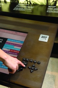
Figure 2: the UKP-I (Universal Keypad – Interactive) is a tactile button pad that facilitates navigation of digital interfaces, and provides volume control and zoom functionality
- Mobile application
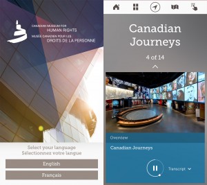
Figure 3: the CMHR Mobile app is a critical component in the ecosystem of inclusive design and accessibility and the Canadian Museum for Human Rights


The UKP-A provides audio enhancement for a playback device, typically simple audio or video playback that does not require any interaction from the visitor. The UKP provides a stereo headphone jack and controls for increasing or decreasing volume and the ability to play an alternate audio track.
The UKP-I includes the UKP-A functionality and further provides a set of controls that provide interactivity with a single application running in the foreground on a computer. The keypad emulates specific buttons on a keyboard, and software developers are expected to map these specific keystrokes to particular functionality in the developed application. Care will need to be taken by developers to be aware of the keypad as an alternate device if a keyboard is expected to be part of a given interactive experience so conflicts don’t arise in use.
The mobile application is available for both iOS and Android and provides a layer of accessibility when neither of the two keypad approaches are implemented because of limitations in physical construction, design, or content. As a general rule, at this time, the mobile application is the least preferred solution, since it is not synchronized with the exhibit experience and is removed from any direct interaction with the exhibition as part of a visitor shared experience.
Expected keypad functionality
The UKPs are bespoke pieces of hardware designed and developed by Electrosonic, the company responsible for all the of AV hardware and integration. Early on, it was decided that the UKPs would emulate keyboards to make implementation with each of the media producers easier, because working versions of the board for testing wouldn’t be available until late in the exhibit development process. Ideally, the boards would have a custom communications protocol that would take place via serial communication. In turn, each of the custom boards were fitted and installed by the exhibit fabricator, Kubik.
UKP-A (audio)
The UKP-A is made to deliver audio content. The UKP-A is a standalone piece of hardware and does not require any interactivity with playback hardware. It is a passive piece of hardware as far as content delivery hardware is concerned. The UKP-A is headphone-jack aware and resets itself to a baseline audio level whenever a headphone is plugged in. In other words, if a user has turned up the volume on the UKP-A, when headphones are unplugged and the next set of headphones are plugged in, the volume will reset itself to the original preset volume level. The UKP-A does not communicate the presence of inserted headphones to any parent device, and no keypress is registered.
There are four components:
- Audio button: switches the audio playback between channels 3 and 4
- Decrease Volume button: decreases the volume of the audio being played
- Increase Volume button: increases the volume of audio being played
- Headphone jack: made for most standard mini-headphone jacks
UKP-I (interactive)
The UKP-I has the same components as the UKP-A and adds a Direction Pad (D-Pad) and additional controls to enable visitors to interact with an application. As with the UKP-A, volume is independent of any parent application, and the volume of the UKP-I is reset upon removal and insertion of headphones into the jack. The UKP-I acts as a keyboard, sending back key presses to an application. The UKP-I also has a toggle switch allowing two complete sets of keyboard mappings. This was provided for interactives that might have up to two keypads connected to the same computer.
There are a total of fourteen components (four being replicated from the UKP-A):
- Zoom In button: zooms the screen in one order of magnification to the object of focus
- Zoom Out button: returns the screen to the original display size
- Audio button: switches the audio playback between channels 3 and 4
- Decrease Volume button: decreases the volume of audio being played
- Increase Volume button: increases the volume of audio being played
- Headphone hack: made for most standard mini-headphone jacks
- Back button: returns the user to their departure point in the previous hierarchy of content
- Home button: reset button for the exhibit, returning the user to the Initial Interaction experience; double tap exits accessibility mode
- Help button: plays a single static message for the specific interactive exhibit
- Directional Arrow buttons: directional keypad with four buttons used for on-screen navigation
- Select button: Used to initiate an action or choose a selection
Exhibit audio architecture
The audio implementation for exhibits is a bit of compromise in the final approach. Given the dynamics of the project, much of the hardware specification was near finalization before the final exhibit and interactive design were completed—especially before the accessibility approach was finalized. Early assumptions realized that multiple audio channels would be required, and every exhibit computer has a Behringer device to provide multiple audio channels from the stereo output from most computers. Additionally, the multichannel need imposed software development restrictions—any platform that couldn’t provide multiple channels would be fairly difficult to use (Adobe Air was the prime victim here). In hindsight, even more channels would have been desired to clean up the overall architecture and provide better flexibility (and would have eliminated some extra media producer effort on the fourth channel).
In the current audio technical implementation at CMHR, each exhibit comes with four channels of audio:
- Channels 1 and 2: stereo (left and right) mix
- Channel 3: a mono mix of the stereo output of channels 1 and 2
- Channel 4: the mono mix of channel 3 with descriptive audio and/or text-to-speech (media producers are responsible for audio ducking)
Channels 1 and 2 are typically delivered to the public speakers of an exhibition, Channels 3 and 4 are delivered to both the UKP-A and the UKP-I. It is convenient to think of channel 3 as intended to accommodate hard-of-hearing listening, and channel 4 most appropriately accommodates vision-impaired users.
A Reaper project file was provided to producers that achieves the above four-channel setup within the constraints of the available hardware. Its software track that maps to hardware channel 4 autoducks whenever output is detected on the text-to-speech track, and mixing occurs in software from 1/2 to both channel 3 (no ducking) and channel 4 (ducking with text-to-speech being louder). This Reaper project file makes certain assumptions about the audio configuration of both the hardware audio device and the software audio routing of the underlying operating system (e.g., the soundflower settings on Mac).
When CMHR did the in-house descriptive audio (DA) work for the insight stations, inconsistencies in volumes were noticed as part of the iterative development process. In the future, both the DA track and the video’s volume track should be normalized to each other. Otherwise, if media producers are responsible for manually audio ducking and then exporting a flattened track that contains both channels, then this isn’t as much of an issue.
Developed by Upswell, a text-to-speech delivery mechanism was developed called Ventriloquist for use by other producers. This tool was developed to work around the limitations in available sound channels for app implementations that can only address two channels of audio output. The code repository for Ventriloquist is available as an open source project, maintained on github at https://github.com/humanrights/ventriloquist.
Visual feedback
Recognizing that possible confusion of control could exist when multiple users were in front of an interactive experience, visual feedback becomes critically important to reinforce when the touchscreen or UKP interfaces are in use. While the team iterated early on trying to resolve an interaction model that would always seem to be “just right” and respond appropriately, a handful of edge cases would always creep into the mix. The final decision to provide a visual cue ultimately resolved any possible confusion.
There should be on-screen visual feedback whenever the UKP-I is being used through a screen notification and a focus highlight. These two elements are a minimum requirement, while additional techniques (typeface bolding, background changes, and other assorted visual techniques) should be used that are not intended to be mutually exclusive with the minimum requirements.
Screen notification
The screen notification is simply a small rectangular overlay situated in the upper right quadrant of the display indicating that accessibility mode has been activated. This notification gives visual feedback to the sighted user that the keypad is the interface in control at the moment and disappears when either the accessibility interface has timed out or the user has touched the screen to return focus to the touchscreen controls.
Focus highlight
A visual highlight or focus rectangle provides additional visual affordance, with the highlight indicating either the content being explored or the interface elements being used by the UKP-I. The highlight/rectangle has a transparent interior so as not to obscure the specific content and an opaque outline. A soft glow around the exterior of the rectangle can be used to provide additional visual feedback.
Magnification controls
For a certain subset of visual users, it was realized that we need a visual analogue to the audio approach of allowing users to increase the volume of the experience. As a result, all of the interactive elements allow users to zoom in to screen content. working through a combination of possible zoom amounts and interface controls, it became evident that a fairly simple approach would provide most of the benefit. A single level of zoom with focus that followed the same focus provided by the UKP ended up being fairly straightforward for most developers to implement.
The magnification controls of the keypad that provide increased detail for users require larger text and images to interact and review content. The magnification controls work in conjunction for the focus highlight described above by zooming on the object currently highlighted. There is a single level of magnification, and the zoom in and zoom out buttons alternate between this magnified level and the default view of the application. Pressing either button repeatedly does not increase or decrease the magnification multiple times. As the user navigates around the screen, the magnified area follows the focus highlight, jumping around the screen as needed. Zooming back out restores the default view of the application and no longer jumps the entire screen around as the focus highlight moves.
While the physical size of the screen and actual on-screen experience should be considered in determining the zoom levels, the general specification is to have the default view be 100 percent and to have the zoomed in view be 200 percent of the default view.
While the current implementation jumps focus around for the user, an ideal version would smoothly transition between the different areas of focus in a quick pan. Timing of this would need refinement, and the motion ramp would need to be finessed (non-linear, with ramps at the start and end).
Audio feedback
A handful of audio sounds were developed for the museum to provide consistent feedback to users across all of the interactive elements. Each of the sounds are quick, simple, and distinctive, intended to augment experience and not detract from the content being experienced. As the complexity of future interfaces evolves, additional sounds may be required as part of the baseline audio experience.
- back.wav: to be played when the back button’s action is completed
- exit.wav: to be played when accessibility mode is terminated
- option_next.wav: to be played when the right arrow key is pressed
- option_previous.wav: to be played when the left arrow key is pressed
- option_select.wav: to be played when the select button is pressed
- option_wrap.wav: to be played any time a list of items wraps from start to end or end to start
- screen_change.wav: to be played when a new screen of content is presented
- startup.wav: to be played when accessibility mode is initiated
Sounds that were not originally in the overall specification but should be added to the suite of interface sounds include:
- container_change: to be played when the focus changes containers
- screen_wrap: to be played when focus moves first to last or last to first containers
Touchscreen vs. UKP-I control
When a user presses any of the buttons on the interactive portion of the UKP-I, the interactive should switch to accessibility mode, which is indicated on-screen through visual feedback, and the experience proceeds with the “Initial Interaction.” When the user touches the screen while accessibility mode is engaged, a short countdown should initiate, which indicates a return to touchscreen controls. This countdown needs to also be conveyed verbally to the eyes-free user.
- If this countdown completes, control is then assumed to be on-screen, and accessibility mode is turned off.
- If the countdown does not complete because any key on the keypad is pressed again, accessibility mode is maintained and the countdown is disabled.
Initial Interaction
Every time a visitor engages with an interactive that has been reset to the default state, the inclusive interface requires two selections:
- Language selection
- Playback speed
Language selection
Language selection is optimized for a single purpose: to get the system set to the appropriate language for the user as quickly as possible. To this end, this selection is designed to quickly present a binary choice in both languages. Below, the language to be spoken is indicated (e.g., EN or FR). Color is also used to indicate the language the given text should be spoken in.
| Input | Output |
| Any Key | EN: “Press Select to continue in English”
FR: “Use Arrow Keys to choose French” |
| Any Arrow Key | FR: “Press Select to continue in French”
EN: “Use Arrow Keys to choose English” |
| Select | (Set language, and go to speed selection.) |
Playback speed
There are five possible speed values: slowest, slow, standard, fast, and fastest. Below is a mapping of canonical speed names to words per minute (wpm):
- Slowest: 80 to 90 wpm / 25 percent of max value
- Slow: 100 to 110 wpm / 35 percent of max value
- Standard: 160 wpm / 50 percent of max value
- Fast: 240 wpm / 75 percent of max value
- Fastest: 320 wpm / 100 percent of max value
| Input | Output |
| (Got here from Language Selection) | (In Normal speed) “Speed, Standard, 3 of 5, (PAUSE), use Left and Right Arrow Keys to adjust speed. Press select to activate.” |
| Right Arrow | (In Fast speed) “Fast, 4 of 5, (PAUSE), use Left and Right Arrow Keys to adjust speed, press select to activate.” |
| Right Arrow | (In Fastest speed) “Fastest, 5 of 5, (PAUSE), use Left and Right Arrow Keys to adjust speed. Press select to activate.” |
| Right Arrow | *Wrap Sound* (In Slowest speed) “Slowest, 1 of 5, (PAUSE), use Left and Right Arrow Keys to adjust speed. Press select to activate.” |
| Select | (Set speed of voice and proceed to main content) |
Preferred voices (as of 2015)
There are preferred English and French voices that have been specified for use throughout the museum’s exhibits:
- OS X – French: Julie
- OS X – English: Samantha
- Windows – French: Harmonie
- Windows – English: Heather
Captioning
Experiences that deliver content by audio must have other means of accessing this information for people who are hard of hearing or are Deaf, or for those who speak another language then that being projected. Captioning allows the rendering of speech and other audible information in the written language of the audio, differentiating captions from subtitles, which render the speech of audio containing alternative language or dialect. Captions allow descriptive audible information and subtitle information to be displayed together, which has advantages for the Deaf and hard of hearing.
Caption files are delivered as a separate digital file (e.g., an .srt text file) to allow the media program to be customized for a variety of presentations. For example, the use of a caption file allows for a customized presentation whether the media is being delivered in a theatre, as part of a built exhibit, or to a mobile device. This also provides greater accessibility for visitors playing media on a personal mobile device for which they have set their own preferences.
Captions are considered “closed” and can be toggled between an “on” and “off” state. By default, all media in a theatre presentations have captions displayed. For instances where the presentation is more intimate or discrete (e.g., digital kiosk), the player allows for captions to be turned off.
Experiences must be organized so important sightlines are established and maintained. For example, if a person who is hard of hearing or is Deaf is watching a screen, showing captioning and sign language must be in-line with the stage area, so both can be watched at the same time. Therefore, it is important that placement of the captions are considered to allow for sign language to appear adjacent to the text.
Sign language (ASL/LSQ)
The official working languages of the Canadian Association of the Deaf (CAD) are American Sign Language (ASL) and la Langue des signes quebecoise (LSQ). These two languages have equal status and first priority within the CAD and its activities, and were selected as solutions in meeting our commitment to universal design. The production and recording of ASL/LSQ for the presentation of all linear media in the exhibition program was undertaken to support the needs of this audience in both official languages.
Experiences can be challenging for a person who is a native user of American Sign Language (ASL) and la Langue des signes quebecoise (LSQ), because English and French are not their native languages, so their reading level in English and French can be much lower than their ability in their native (sign) language. The integration of ASL/LSQ through a signing bubble or some other means is a possible solution. The decision was made to create a standardized player for digital kiosks to allow the presentation of captions alongside ASL/LSQ, allowing for both features to be toggled on or off separately to suit a visitor’s preference. When linear media in presented in a theatre, sign language appears integrated into the media program.
Mobile application and Bluetooth beacons
A mobile application was developed alongside the exhibit program in response to several priorities of the museum. One of those priorities was to create the opportunity for the exhibit program to be accessible to the broadest possible audience. This acted as the final delivery mechanism for content when other means weren’t possible. For example, at certain locations which rely on gesture interaction, use of a UKP became impractical and would require substantial changes in either the physical design or experience. As a result, the mobile application was realized as the common platform that could serve content even if it fell short of delivering the same sort of interactive experience.
The mobile application was developed for both iOS and Android from the start with full accessibility embedded following the current best practices of mobile platforms. Ironically, this sort of accessibility is some of the best developed given the high proliferation of mobile multi-touch devices over the last decade, and an incredibly active community. In a nod to experience design, it was determined early on to use low-energy Bluetooth beacons as a mechanism to trigger the availability of nearby experiences. The intent was to have the application feel fairly contextual, giving visitors ready and quick access initially to the content that was physically nearby as they moved through the museum, and then allow additional exploration if desired.
Estimote beacons were selected from a growing field of options, and testing of the beacons took place multiple times in the galleries to better understand the reflectivity and blockage of signal in the physical environment. Finding the right balance between signal strength, distance, frequency of signal, and battery life was fairly tricky and required a fair amount of individual attention to fully resolve. Additionally, all the beacons were removed from their geodesic rubber housing and inserted into custom exhibit boxes that were more easily located throughout the exhibits and integrated better with the overall design.
Future exhibit implementations and exceptions
At a very practical level, these guidelines dictate the preferred approach to accessibility for exhibitions moving forward at CMHR. The thinking reflected here is based on the experience of the initial development process and a comprehensive review of all the interactives after being installed for approximately one year. While these guidelines work well for the current approach to accessibility at CMHR, the authors fully recognize other institutions may have their own unique circumstances and requirements. We hope that the community begins to understand the underlying model for accessibility as a foundation for their own efforts, especially as multi-touch screens become more prevalent and offer simpler modes of interaction.
Permanent exhibitions
While there is generally good accessibility throughout the galleries, there is no single best example that incorporates all of the suggested guidelines. Ideally, CMHR would work with a single media producer to develop a new reference model for accessibility using the guidelines presented in this paper. This reference model would encapsulate all of the interface requirements and approaches and become the new standard for permanent exhibitions going forward.
The developed reference model would expect the following baseline requirements:
- Implement interactive experiences with the keypad (UKP-I)
- For narrative content, produce ASL and LSQ components
- For video, produce descriptive audio
- Where possible, use Ventriloquist for text-to-speech
- Incorporate audio feedback to all on-screen elements
- Develop complementary mobile component
However, this reference model should be viewed as an intermediate approach, and over time the interactive keypad (UKP-I) should be deprecated from the museum exhibits. They are a good solution, but with the increasing availability of multi-touch screens in different sizes and the rapid advancement of accessibility on mobile platforms, a multi-touch approach should be developed using multi-finger gestures for interaction. The audio keypad (UKP-A) should continue to be used as a method for providing audio capability to experiences that don’t include interactivity.
Traveling exhibitions
For those exhibits that originate at CMHR, the guidelines for permanent accessibility should be followed. This means implementing experiences using the existing equipment setup (including audio) and the keypad (UKP-I). This ensures that exhibitions work well within the CMHR environment. However, given that few other locations will have a comparable setup, there’s an escalating set of effort that should be applied to development. There is no single best solution, but rather the best method results from a combination of resources available, time, and cost. In order of easiest to best:
- Develop complementary mobile component
- Develop HTML5-based apps
- Develop Swift-based apps for iOS (stronger, more consistent accessibility foundation in iOS)
- Develop Swift-based apps for OS X using multi-touch interfaces
Exceptions
Where these guidelines fall short, understanding the intent of accessibility outlined earlier in this document is key to finding a reasonable compromise and managing expectations. One would argue that for good accessibility there should not be any exceptions, but in compromise situations some accessibility is always better than no accessibility.
In the inaugural exhibitions, three exhibits were compromise situations: a gesture-based experience using the mobile app as a keypad alternative; a set of iPads (which were developed for iOS and are outside of the exhibit audio and accessibility infrastructure—in these instances, accessibility is typically pushed to the mobile experience); and installations with movable benches that required delivering accessibility via mobile devices, since no UKP-A was available as part of the typically installed theater seating.
Any exceptions need to be considered thoughtfully and on a case by case basis.
3. Iteration is the mother of all success
Now that the CMHR has been open to the public for one year, museum evaluation, visitor surveying, and overall general visitor feedback are helping inform iterative design and development for inclusive visitor experiences.
Defining success
The CMHR has been recognized for the approach it has taken to providing an inclusive and accessible experience for all, irrespective of ability, age, or gender. As highlighted elsewhere in this paper, success can be difficult to quantify. Even if the CMHR could be labelled “the most accessible museum in the world,” would that mean the institution has achieved the scope of its ambition? Would that mean any and everyone can enjoy the museum’s offerings independently in the same ways?
Defining the success of the Canadian Museum for Human Rights approach to inclusive design needs to be addressed on both the individual instance or product level and across the institution as a whole.
UAP and mobile app
The Universal Access Points and CMHR mobile have been extremely functional in providing access to content that might otherwise be inaccessible. The reading aloud of printed text, and artefact and image descriptions, has made accessible content that would otherwise have been inaccessible. This function has proved to be successful not only for blind or vision-impaired visitors, but also for those who cannot read the text (for example, some visitors whose first languages are not English or French).
Given content can be accessed via the app irrespective of location, additional inclusivity has been achieved since that access to information and content within built environments is no longer restricted by on-site attendance.
Finally, the mobile app is created like an armature, whereby functions and content can be easily added, so the app is scalable in breadth as well as depth. Added recently to the app (and available via UAP) are ASL and LSQ Self-Guided Tours, Audio-Described Self-Guided Tours, and content functions such as personal/individually controlled rotation and investigation of three-dimensional artefacts (Bentwood Box Object Exploration).

Figure 4: the UAP is a system of four components, including the CMHR Mobile App, that ensure even static and non-digital content is made accessible to all audiences
While functions like the ASL Self-Guided Tour increase inclusivity of the core exhibitions to wider audience demographics, content applications like Bentwood Box increase access to content for everyone. The Bentwood Box, carved from a single piece of cedar by Coast Salish artist Luke Marston, was a centrepiece for much of the Truth and Reconciliation Committee proceedings, receiving diverse offerings from participants. The box itself is intricately carved, and each carving has deep meanings. The placement of the Bentwood Box within a case meant intimate access to the carvings and their significance was difficult to facilitate. It also meant anyone with a sight impairment would have even greater difficulty learning about this important artefact. The CMHR mobile app allows visitors to examine the carvings of the Box in detail and, whether seen or read aloud, ensures unparalleled, inclusive access.

Figure 5: when explored via the CMHR mobile app, the Bentwood Box provides a level of inclusive access that would not be possible via the gallery experience alone

Figure 6: when explored via the CMHR mobile app, the Bentwood Box ensures that the carvings and their symbolism are made accessible to everyone via text-to-speech
UKP
The Universal Keypad has proven successful in facilitating access to navigable systems and in providing audio control (volume adjustment) and zoom functions. While the museum team always envisioned the UKP as a measure that could eventually be replaced by a more sophisticated mobile solution, it has been successful in providing an integrated solution that is easily learnable by all visitors irrespective of ability.
Challenges with the UKP have been to ensure consistency of behaviour across a variety of software platforms and technologies, as well as in a variety of built environments of greatly varying design. This in fact provoked a reconciliation project that led to the formal documentation and specifications for all future development.
Further design iteration is currently underway in determining how the CMHR might introduce induction technology to the UKP so that hard-of-hearing visitors need not use headphones but rather could tune their hearing aids into the frequency output of the UKP itself. The museum is currently at the prototype development phase.
Media production
Media production has proven to be very successful in ensuring an inclusive experience. Captioning and interpretation being on-screen at all times has also raised awareness to the accommodations that can be available, and in terms of development efforts has been cost effective. Described video (audio description) integration through the UKP-A has been an effective means of subtly providing this function on an individual level. The design and development of the built environments with the inclusive design methodology has ensured seamless integration and no compromise on aesthetics preferences.

Figure 7: UAP-A (Universal Access Point – Audio) is well integrated into the built exhibitry and does not appear as an afterthought or late addition
Temporary exhibitions
The Canadian Museum for Human Rights had always planned on presenting temporary exhibitions (exhibitions designed and developed by other institutions and organizations). The determination of how far the CMHR would go to ensure that another institution’s product would meet a high standard of accessibility was a difficult call to make. As such, and to date, each exhibition has been dealt with on a case-by-case basis, with the overall aim of being as close to the CMHR standard as possible, all while evolving and pushing the CMHR standard so that said standard is never a set bar.
At present, the CMHR has presented six temporary exhibitions (five on site, and one outdoor exhibition). With each exhibition, adaptations have been made to enhance the inclusiveness of the exhibition being brought in and presented. In order to enhance and extend the experiential offer, ASL/LSQ interpretation, captioning, and description tracks have been added to linear media. Additionally, alternate versions of presentation, adjustment and changes to color and contrast of the exhibition design, and even supplemental installations/exhibitry have also been made. And, as one might expect, CMHR UAPs have been added to all temporary exhibitions.
Sight Unseen
In February 2016, the Canadian Museum for Human Rights opened a temporary exhibition titled Sight Unseen. This is a photography exhibition where each of the twelve artists featured is blind. Each artist has a unique methodology for how and why they engage in photographic endeavours, and how they achieve the results that they do.
One of the unique aspects of the CMHR’s approach to presenting Sight Unseen in a manner that expands the exhibition’s inclusivity is through the addition of 3D tactile and audio photo interpretations. Working with 3DPhotoWorks, a company cofounded by John Olson and based out of New York state, select works in the exhibition have been translated into 3D-sculpted, tactile recreations. Each recreation is fixed with hotspot sensors that, when touched, engage audio descriptions (descriptive as well as environmental). This is the first time this technology has been exhibited at a museum. As a first for the CMHR, it is a demonstration of the CMHR’s commitment to continue exploring new methods of increasing inclusiveness for all and challenging people’s preconceived ideas about both ability and perception. The 3DPhotoWorks render a visual medium into multisensory media and are intended not only for blind or sight-impaired visitors, but for everyone, challenging people’s ability to see using not only their eyes, but also their fingers and ears.
While the exhibition has only just opened, it has opened to extremely positive reviews from a variety of stakeholder groups and the general public.

Figure 8: Sight Unseen employs 3DPhotoWorks: carved, tactile images with audio description that render a purely visual medium of photography into a multisensory experience
True success
In 2010, the Canadian Museum for Human Rights set itself a bold ambition: to self-mandate an inclusive design methodology across all aspects of its enterprise. This mandate has led to many challenges worthy of attention. It was the belief of those few involved back then that inclusive design could be a driver for innovation. It has in fact led to the design and development of the Universal Keypad (UKP-I and UKP-A), the Universal Access Point (UAP), the unique CMHR mobile app, the development and engagement of key stakeholder groups, and even the recent execution of 3DPhotoWorks.
Over the next few months, the CMHR is set to publish its own Inclusive Design Policy (addressing all aspects of the museum operation) as well as a comprehensive digital tome of its Inclusive Design and Accessibility standards, governing the design and development of any internal or visitor-facing media, technology, fabricated structure, or digital product. The core principle of this documentation is that, like the overall approach of the CMHR, they will be living and ever evolving.
Fifteen months after the inaugural opening of the Canadian Museum for Human Rights, it would have been very easy to consider the standard of inclusive design and accessibility complete at the benchmark set by the opening. However, when taking stock of the measure of success at the CMHR, the true success story stretches well beyond any product development—it is the consistently growing institutional commitment to inclusive design. Inclusive design thinking has become a key characteristic of the corporate culture, and there is a brutal honesty and understanding amongst all staff that everyone can do better. It isn’t a dissatisfaction with the current implementation, but rather a need to push to the next new boundary of what’s possible. A pervasive feeling exists that the work isn’t—nor should it ever be—done.
Cite as:
Wyman, Bruce, Corey Timpson, Scott Gillam and Sina Bahram. "Inclusive design: From approach to execution." MW2016: Museums and the Web 2016. Published February 24, 2016. Consulted .
https://mw2016.museumsandtheweb.com/paper/inclusive-design-from-approach-to-execution/